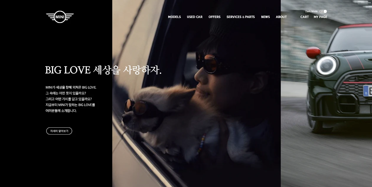
Putting the MINI personality back into the MINI website.
A redesign of a website that had lost the brand it was meant to sell. I wanted the layout, the motion, and the copy rhythm to feel like MINI, not just the photography.
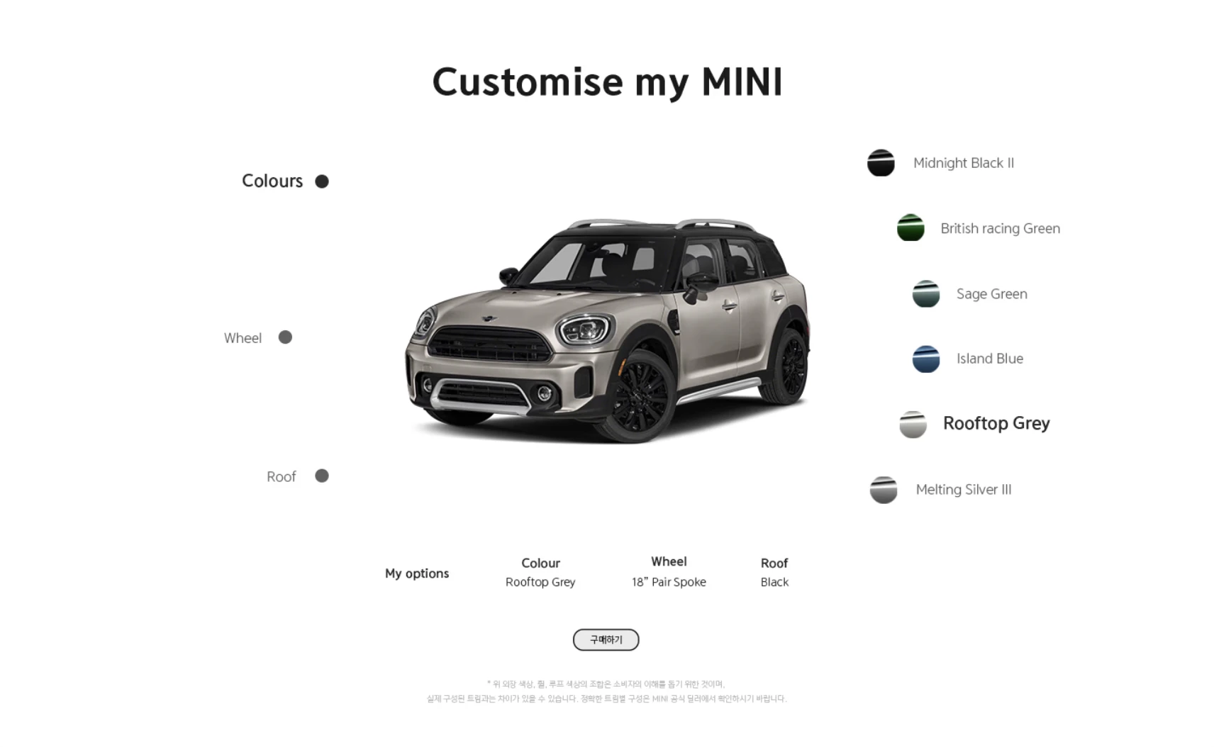
What the project was
MINI's site felt like any other car configurator. Quiet, restrained, a bit anonymous. The car is none of those things. I took on a self-directed redesign to translate the brand into the page itself. No client asked for this. I started it because the gap between MINI's brand personality and its digital presence was too obvious to ignore.
How I worked
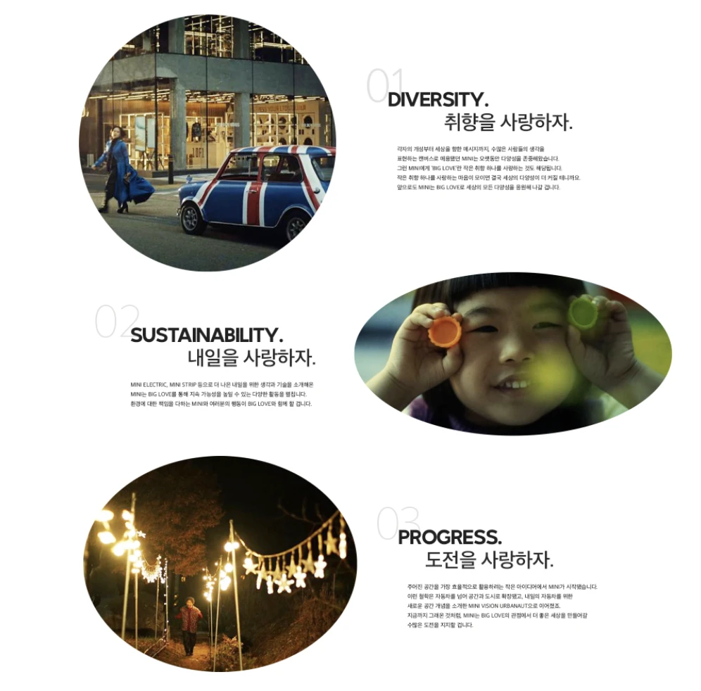
Brand deep-dive
Studied MINI's heritage, current ads, and the gap between its brand voice and the digital surface.
Reference audit
Looked at how other personality-first brands translate tone to a website.
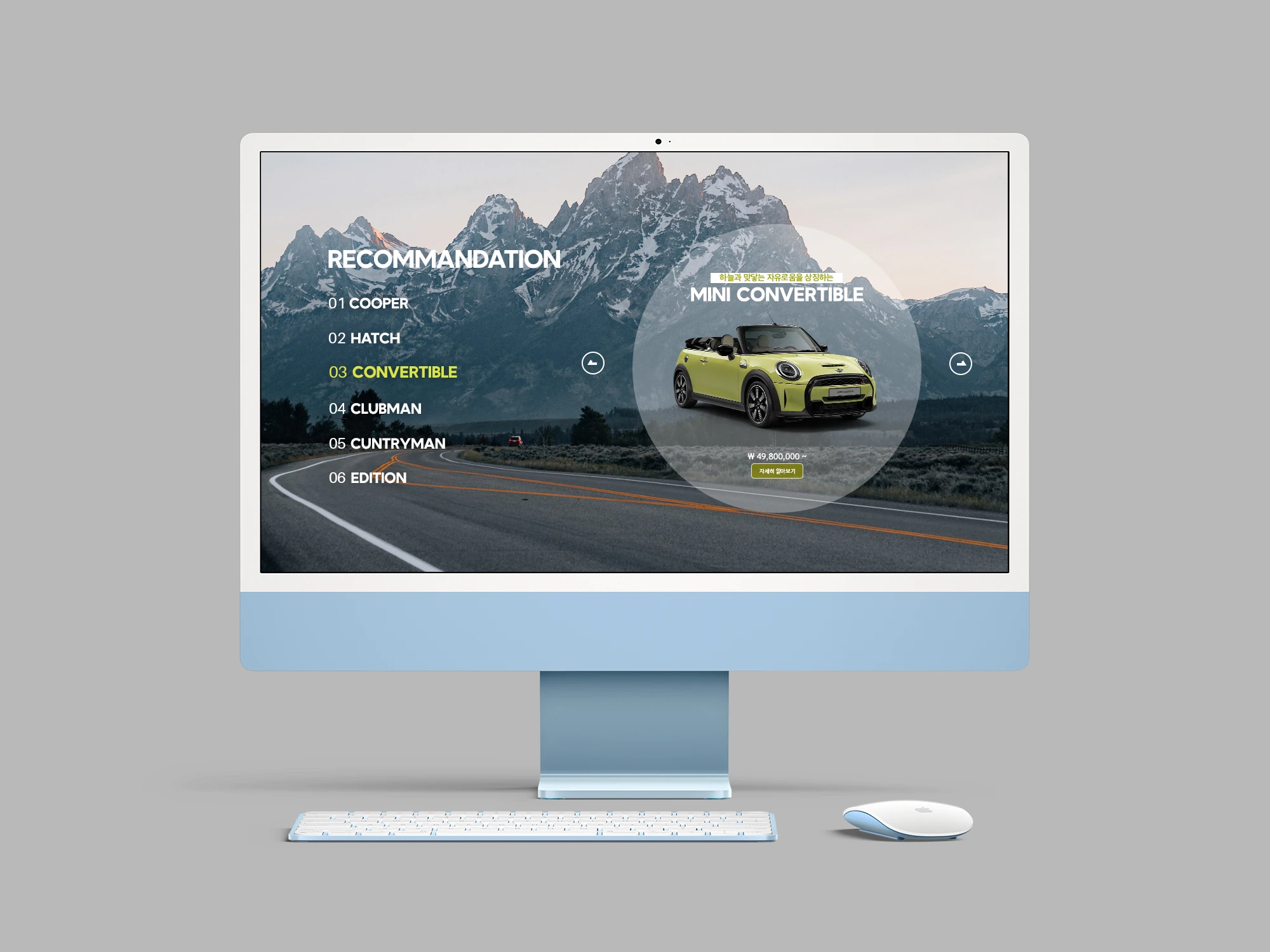
Wireframes
Sketched homepage, model showcase, and configurator with a deliberate copy-led structure.
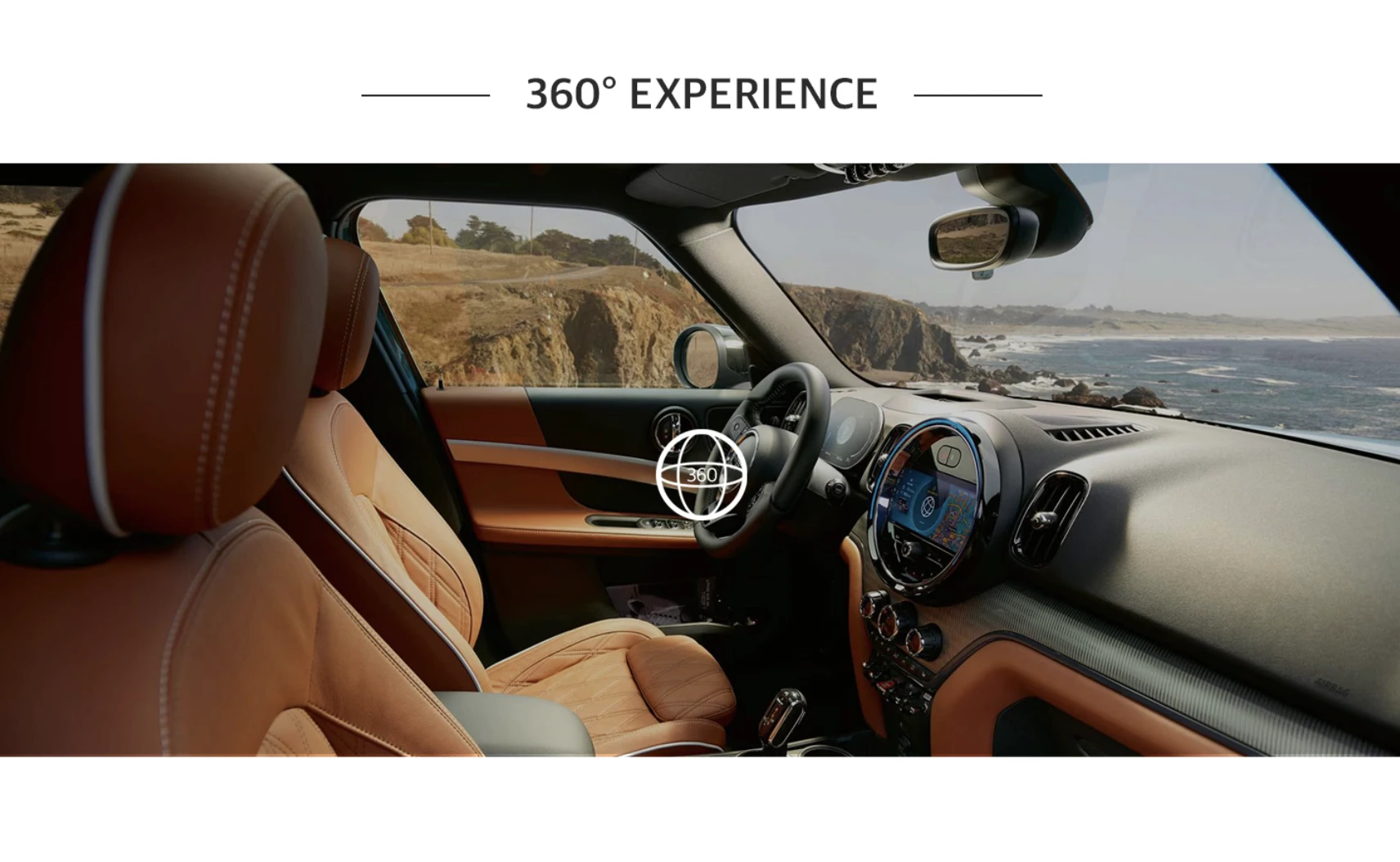
High-fi and motion
Built a microinteraction system. Bouncy hovers, tight transitions, copy that winks.
Compact, playful, unmistakably MINI.
What I took away
Brand-led UX is a craft problem. Personality lives in the specifics. The way a button bounces back, the rhythm of a paragraph break, whether the model overview is a list or a parade. You can't bolt it on later. It has to be the layout.