Trust you can see before you taste.
Brand identity and e-commerce experience for a Korean food marketplace, designed so quality, origin, and reliability come through before the product arrives.
What the project was
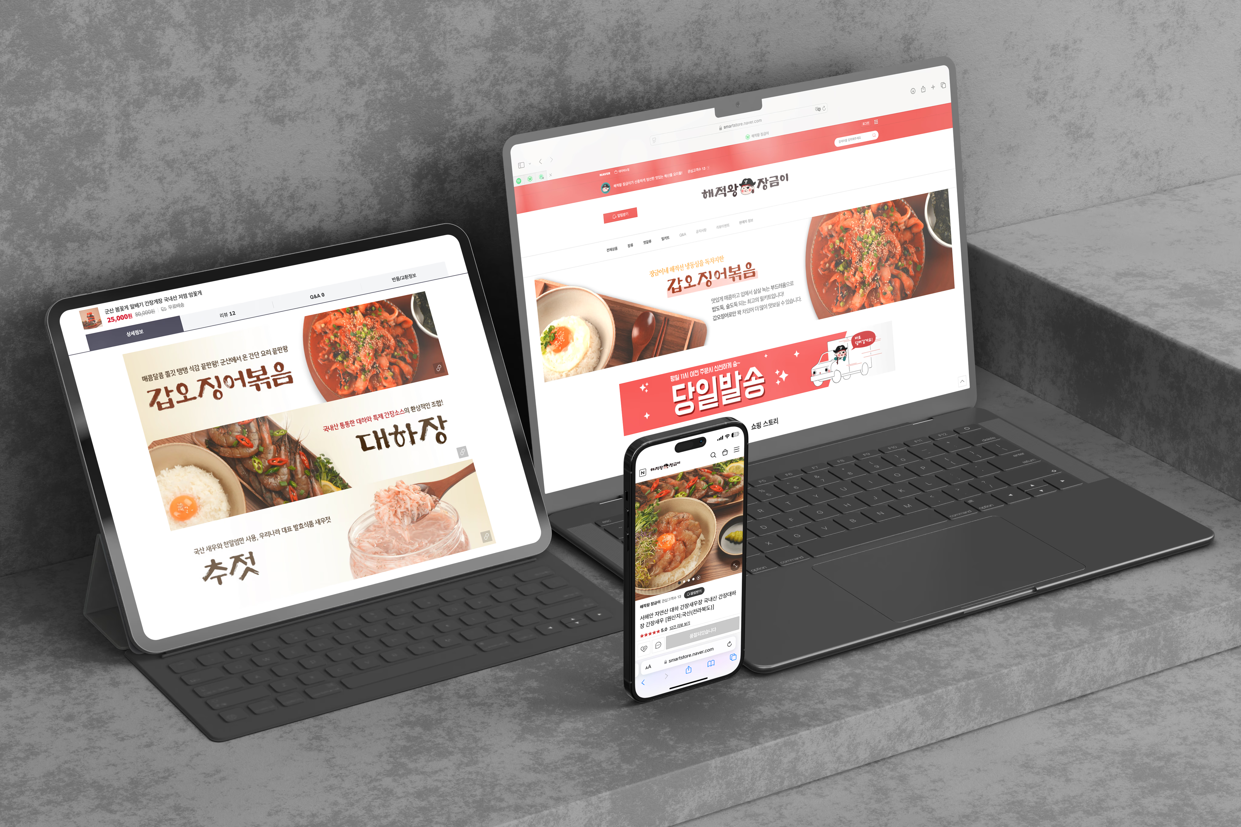
I built the branding and visual system for a Korean food marketplace from the ground up. Because customers were buying food online, trust was the core design challenge. The brand had to communicate quality, origin, and reliability before anyone could taste the product.
View live site →How I worked
Brand foundation
Defined the visual identity that would carry quality and credibility across every touchpoint.
Visual language
Built the typography, imagery, and layout system that keeps the marketplace consistent.
E-commerce experience
Extended the identity into the store itself, from navigation to product listings.
Product detail pages
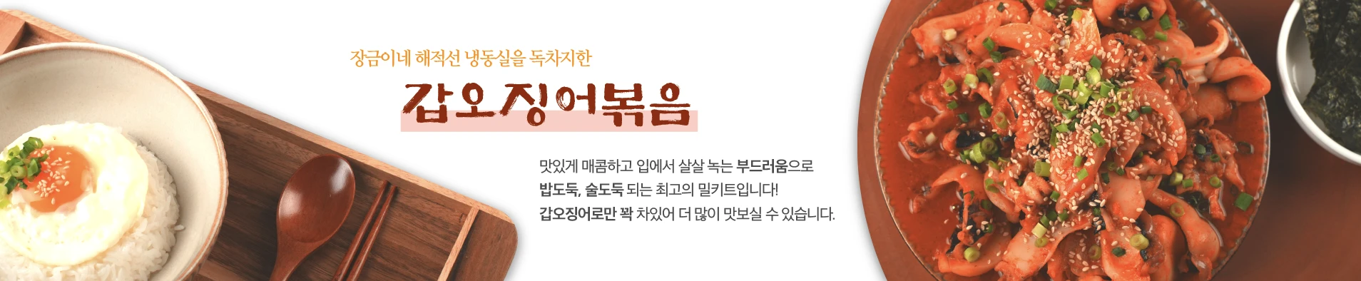
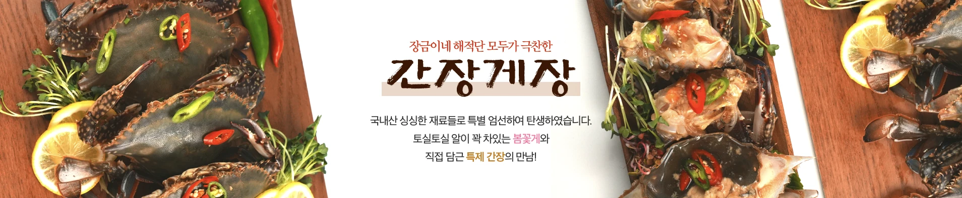
Gave each product enough distinction to tell its own story, within one consistent system.
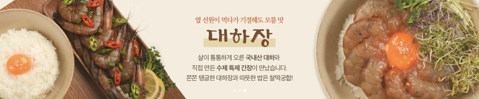
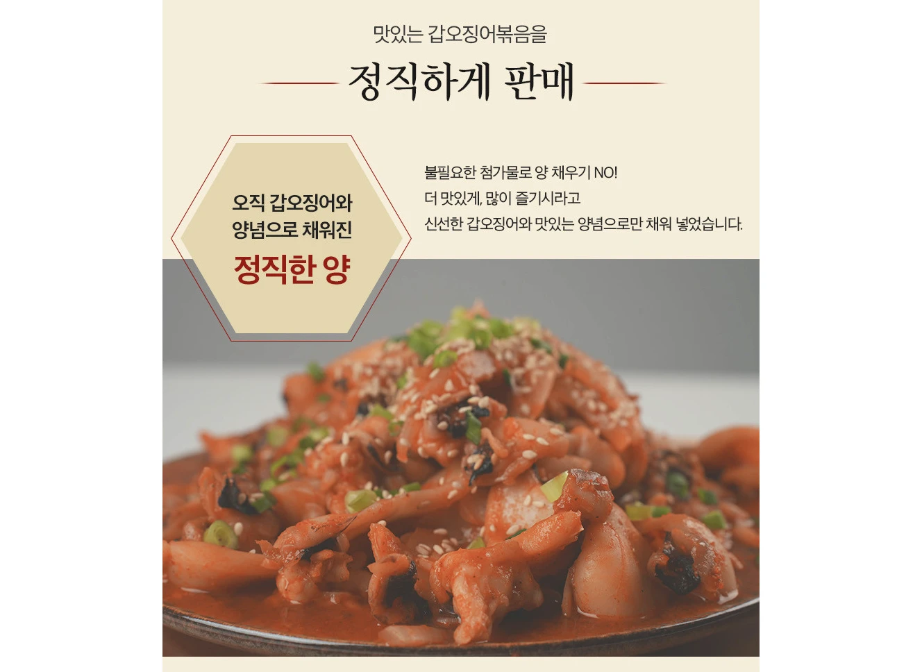
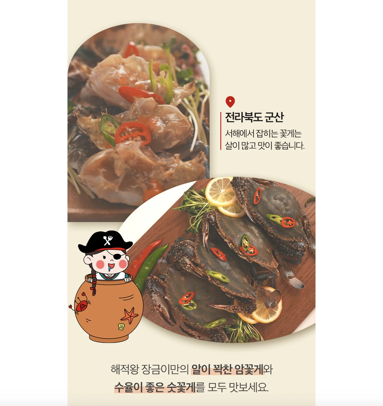
Pages that lead with the food, finish with the cart.
What I took away
What I'm most proud of is working across the full visual experience, from the brand foundation to the final product pages. Design here wasn't only about making the food look appealing. It was about making the marketplace feel credible enough to buy from.