An editorial system for parents who don't have time to read.
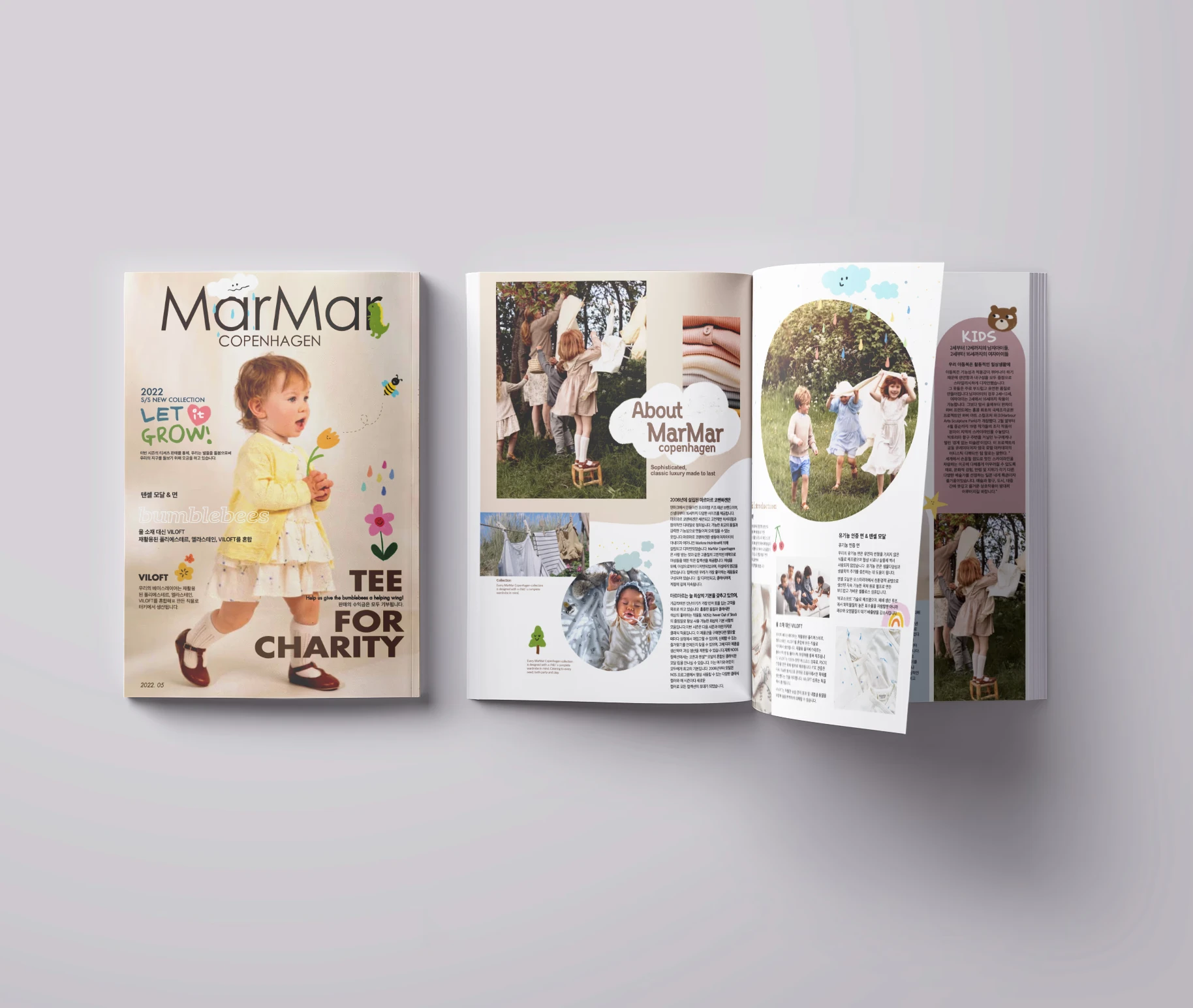
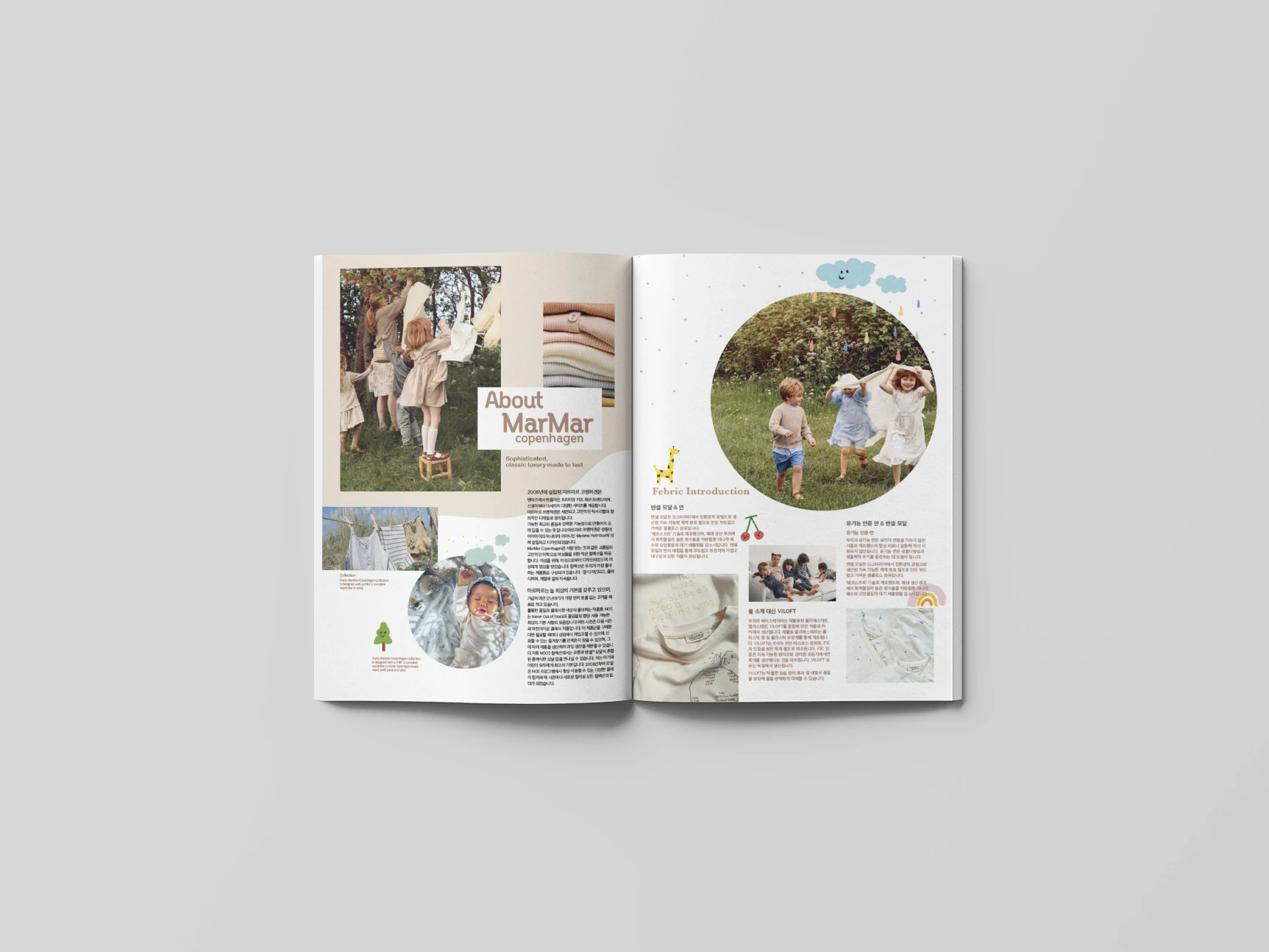
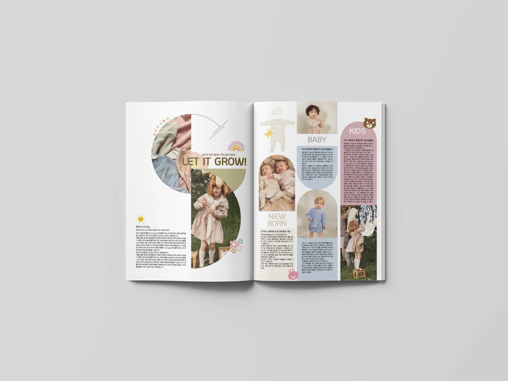
A tabloid magazine designed for MarMar Copenhagen. The brief was to look considered enough to keep around, and read fast enough for a parent with a toddler on one arm.
What the project was
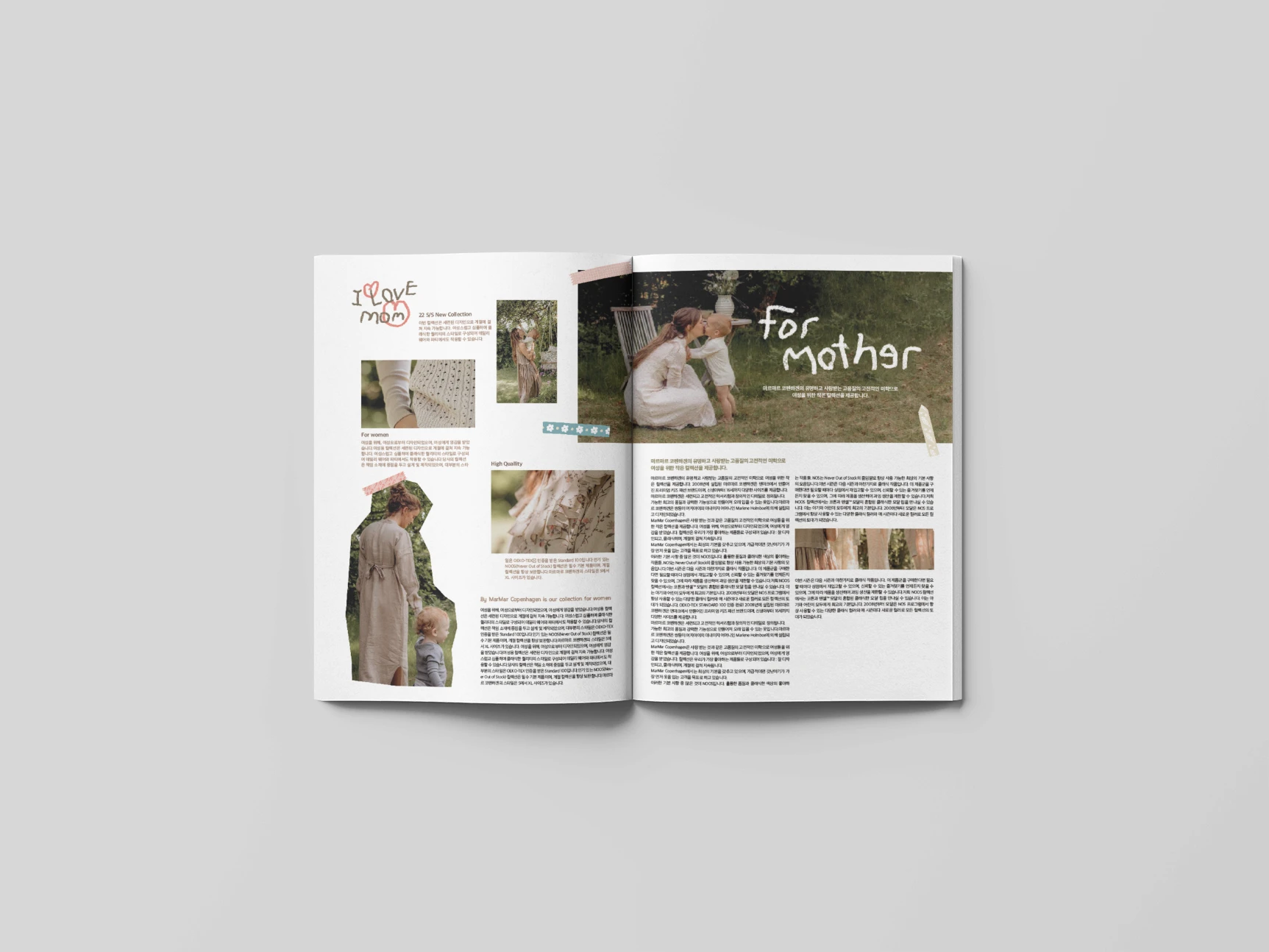
MarMar wanted a tabloid that could sit on a coffee table without looking out of place, but still read in short bursts. That meant rethinking the rhythm of the page. Shorter columns where it mattered, generous photography where it earned the space, and a way to dip in and out across spreads without losing the thread.
How I worked
Audience map
Defined the two reading modes the magazine had to serve and designed for both.
Type system
Selected a serif and sans pairing with a quiet personality, then built the hierarchy that holds the rest in place.
Grid
Designed a flexible column grid that handles features, products, and ads without breaking the feel.
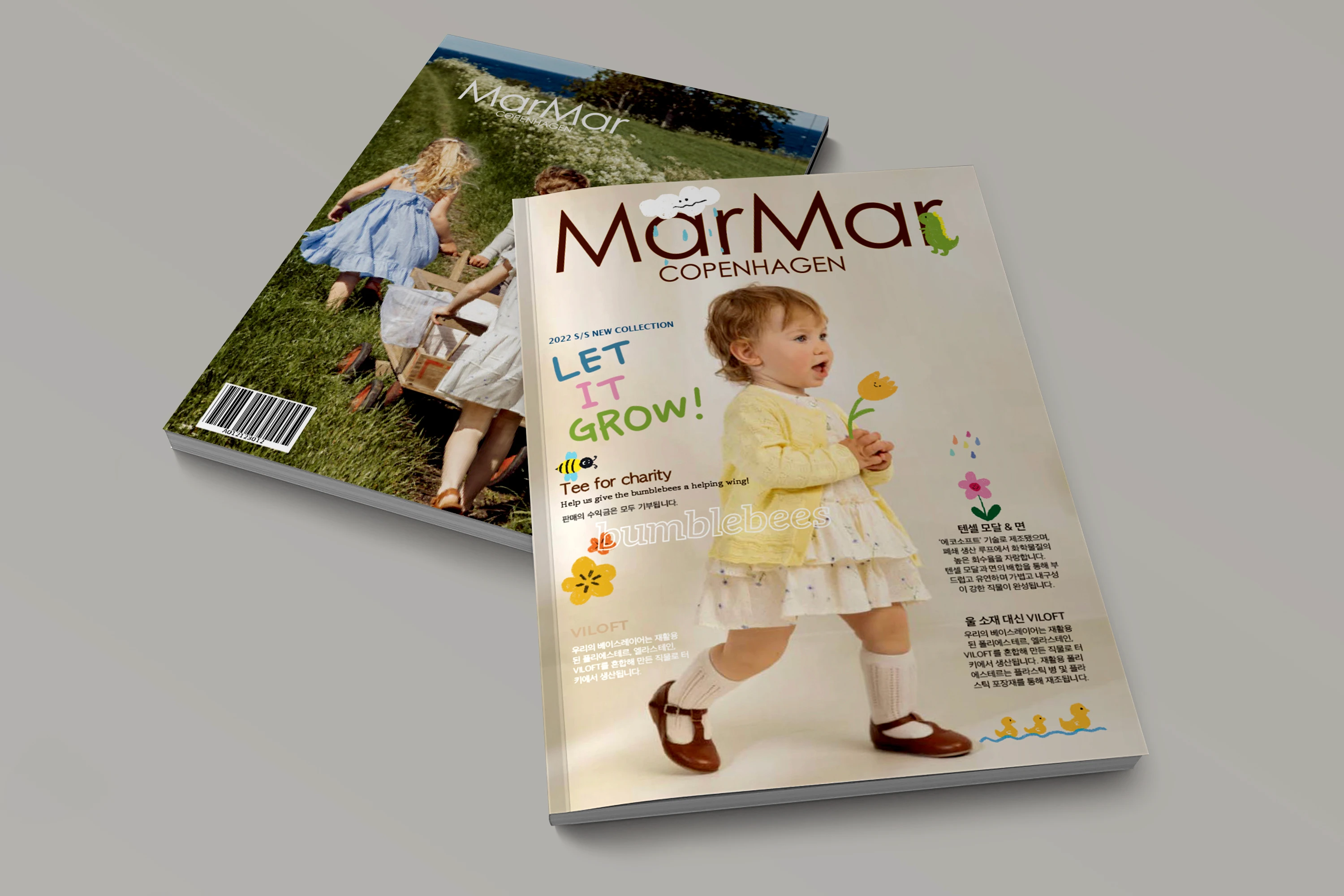
Sample issue
Designed a full set of spreads (cover, features, product pages, ads) to prove the system held up.
Pages that breathe, even when they're full.
What I took away
Editorial design lives in the relationship between word and image rhythm. The system has to disappear, but the reader has to feel the rhythm of it, page after page.