Building a luxury brand for life on the water.
Naming, identity, and applications for a residential brand built around a new category. It had to feel aspirational and credible at the same time.
What the project was
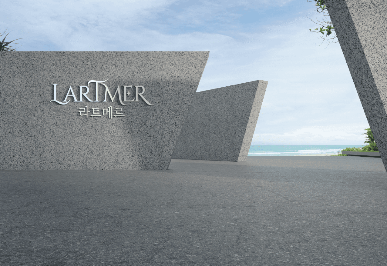
Lartmer is a residential developer for floating cities. Most people had never heard of the category, so the brand had to feel established before the buildings even existed. The work was a full identity system. Name, mark, type, palette, photography direction, and the applications that would carry it into every surface.
How I worked
Workshops
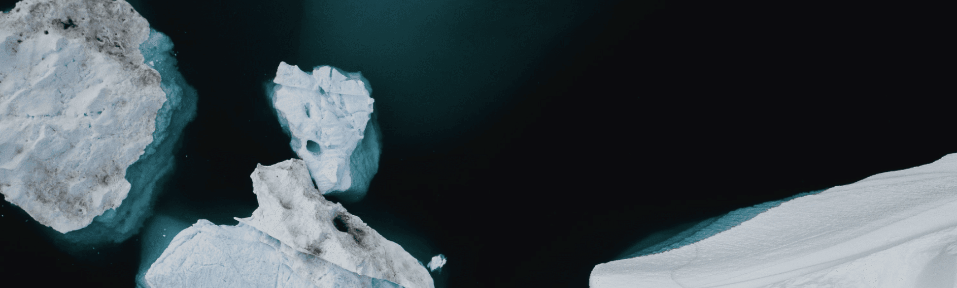
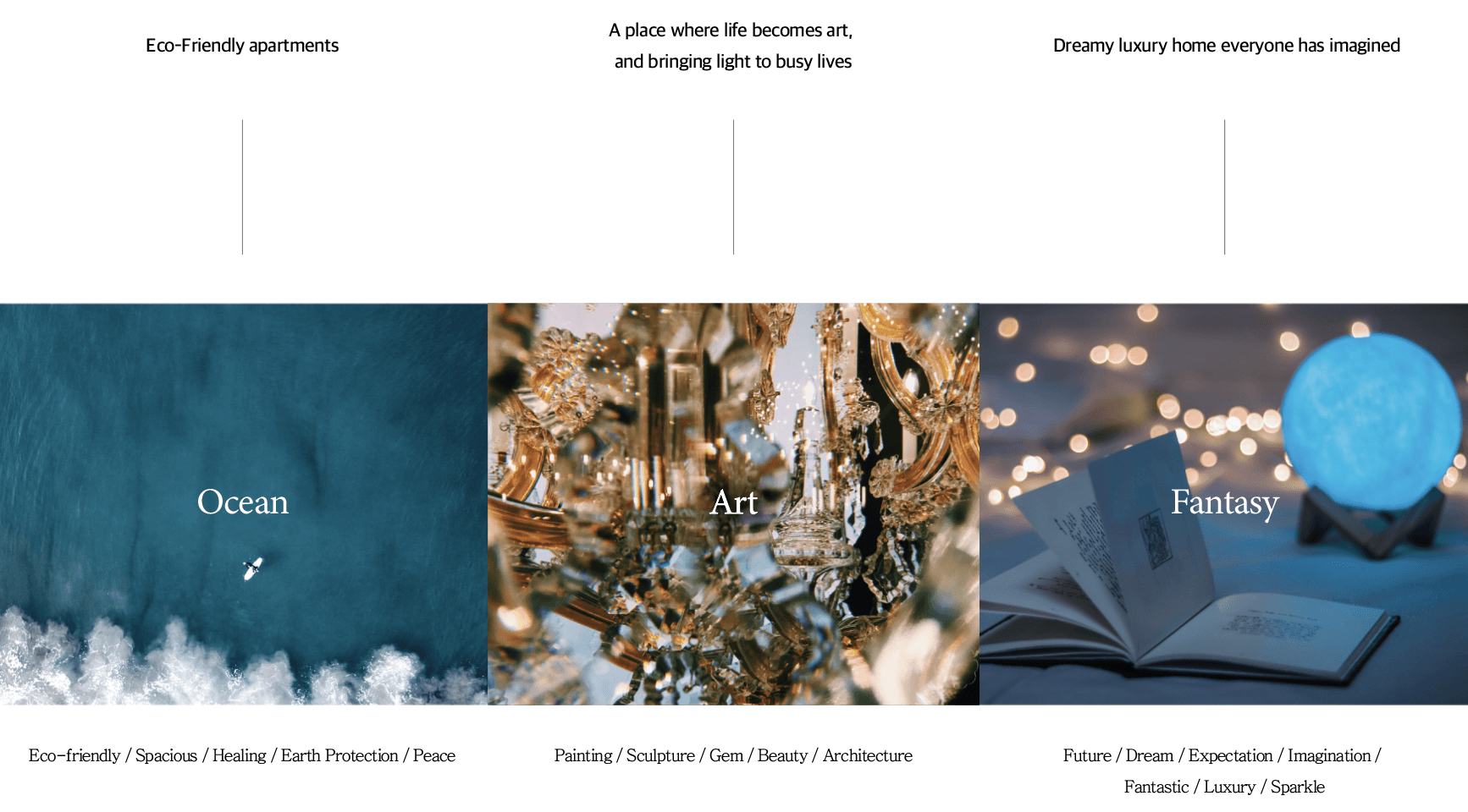
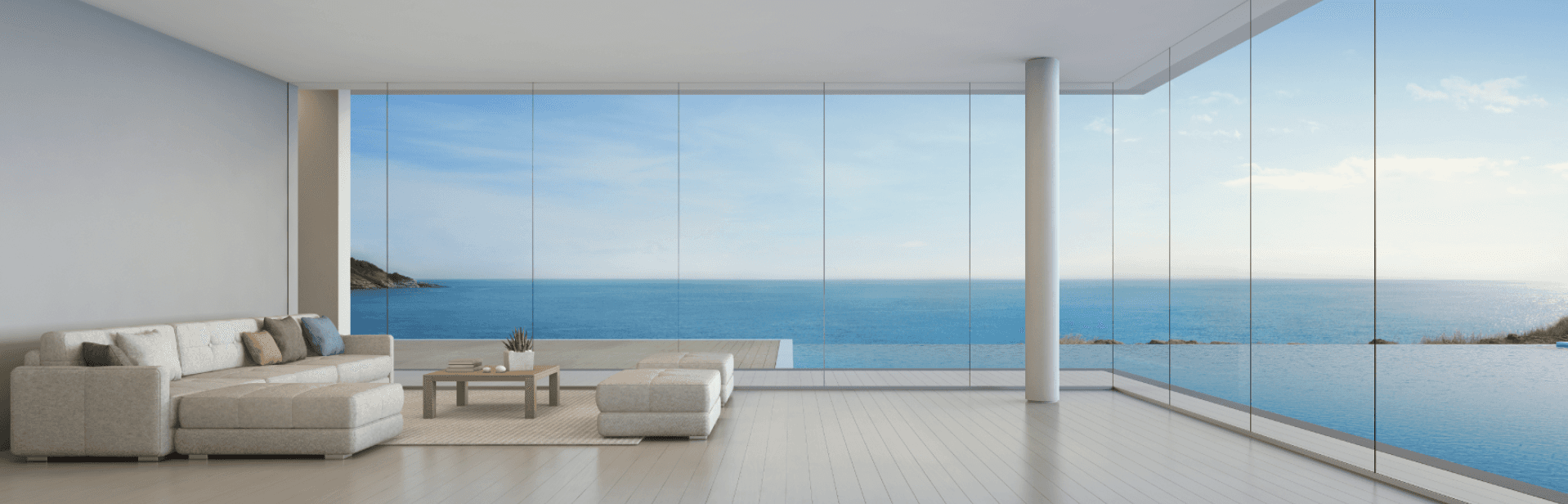
Mapped brand attributes with stakeholders and landed on serene, exact, generous.
Naming
Explored a long list of candidates against tone and trademark. Lartmer felt timeless, slightly French, and ownable.
Identity system
Logotype, secondary mark, typography pairing, palette, and the photography rules that hold the whole thing together.
Applications
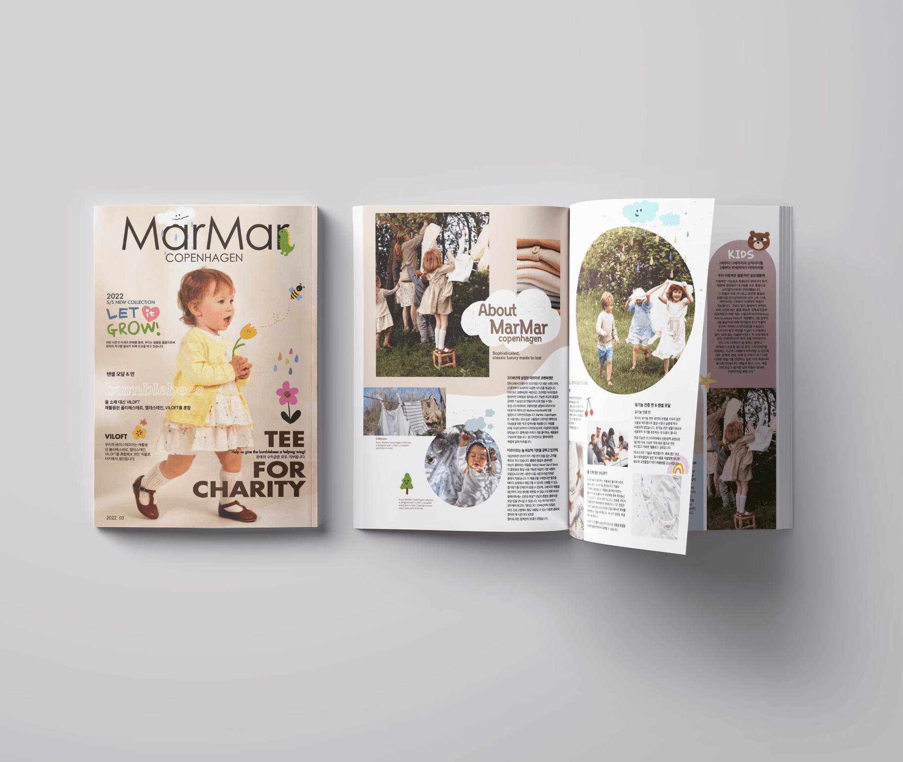
Brochure, business cards, signage, web concept. Proof that the system lived in the wild and not just the guidelines.
A brand that holds across surfaces.
What I took away
Luxury isn't loud. The hardest decision was usually what to remove. A stronger logo with one less line, a palette with two fewer colours, a brochure with more breath between things.