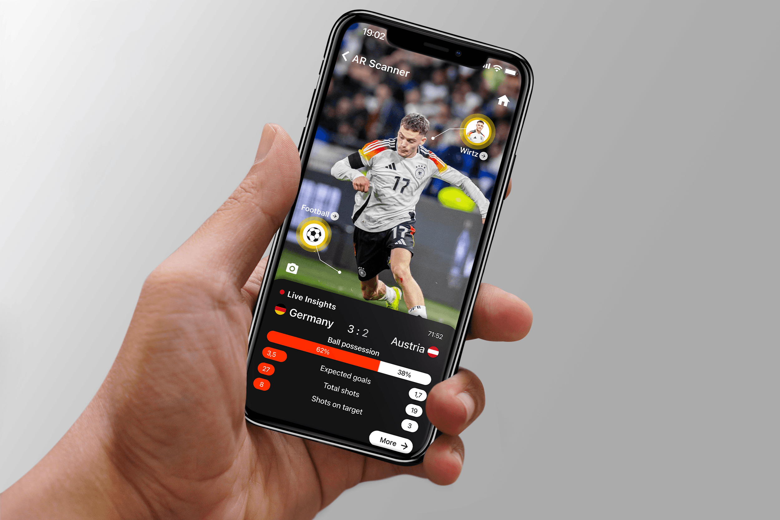
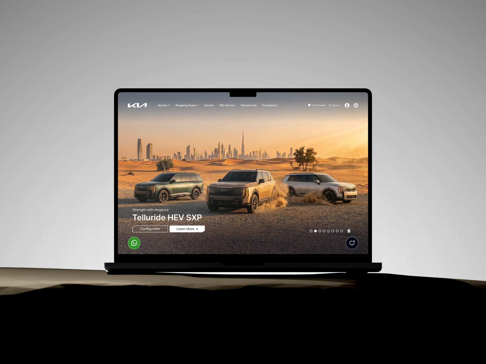
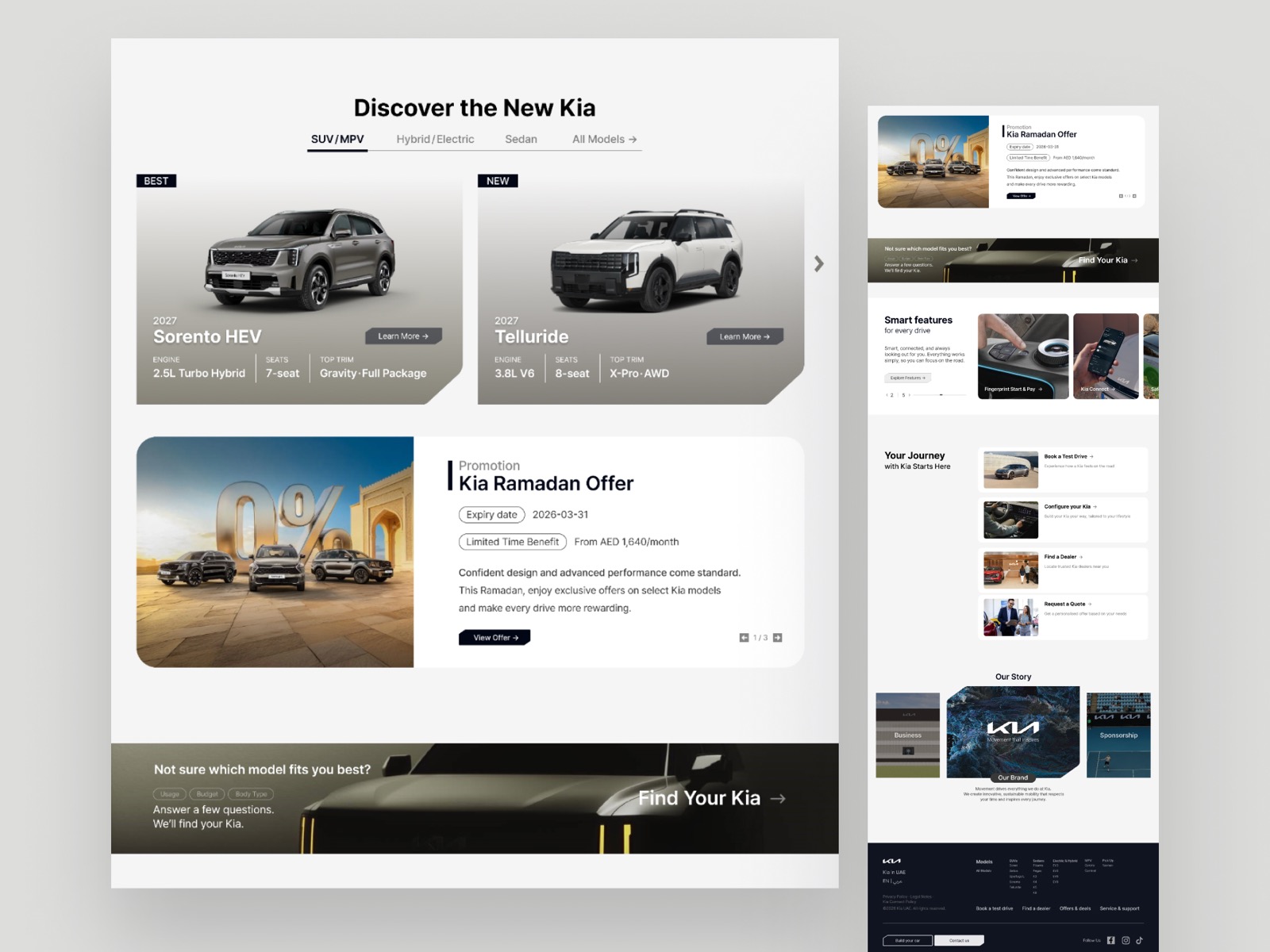
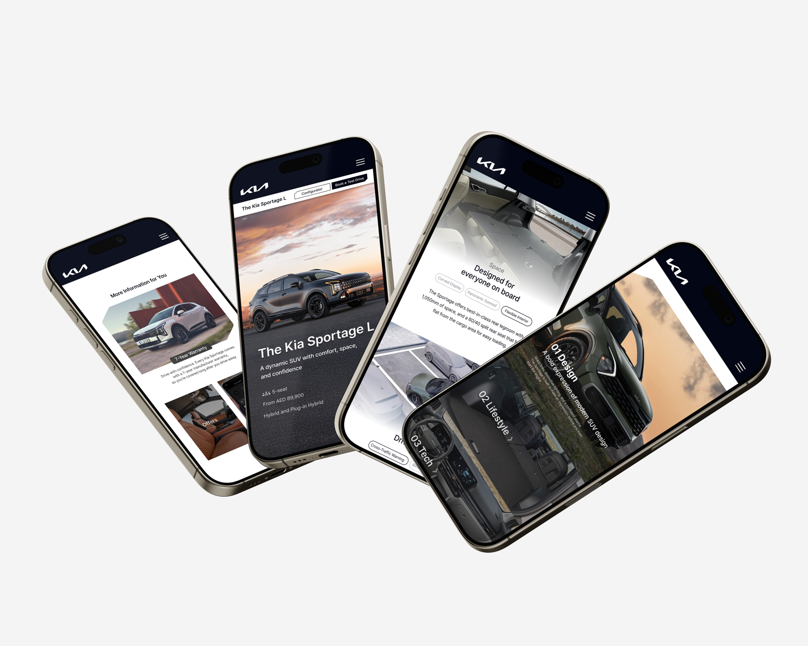
Three of Kia's busiest templates, rewritten in two weeks.
A short freelance sprint to audit the heaviest-traffic pages and redesign the ones that actually moved the needle.
What the project was
Kia's regional site had inherited a lot of layouts from the global template, and over time the page-to-page experience had drifted. The brief gave me two weeks to look at the heaviest-traffic flows, decide what was actually broken, and put together redesigns the team could ship.
I focused on the templates where attention and traffic were highest, instead of trying to retouch everything.
How I worked
Audit
I went page by page, flagging where the hierarchy was unclear, where components had drifted off-system, and where accessibility was leaking.
Reframe
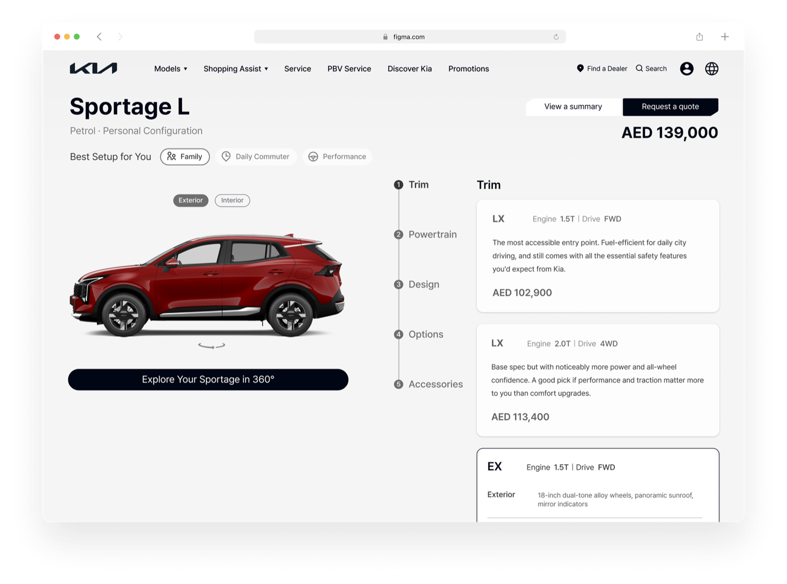
Synthesised the audit into the three templates worth rebuilding first: homepage, vehicle detail page, configurator.
Design
Wireframed each flow, then took them to high fidelity inside the existing global design system. No off-brand components.
Handoff
Annotated specs and a quick walkthrough with the dev team so the redesign could move into implementation without long Q&A loops.
One system, applied page by page.
What I took away
Working inside a mature global design system was the real lesson. The lever wasn't new components, it was composition and information hierarchy. Brand consistency doesn't mean sameness; it means recognisable behaviour, applied to the local context.