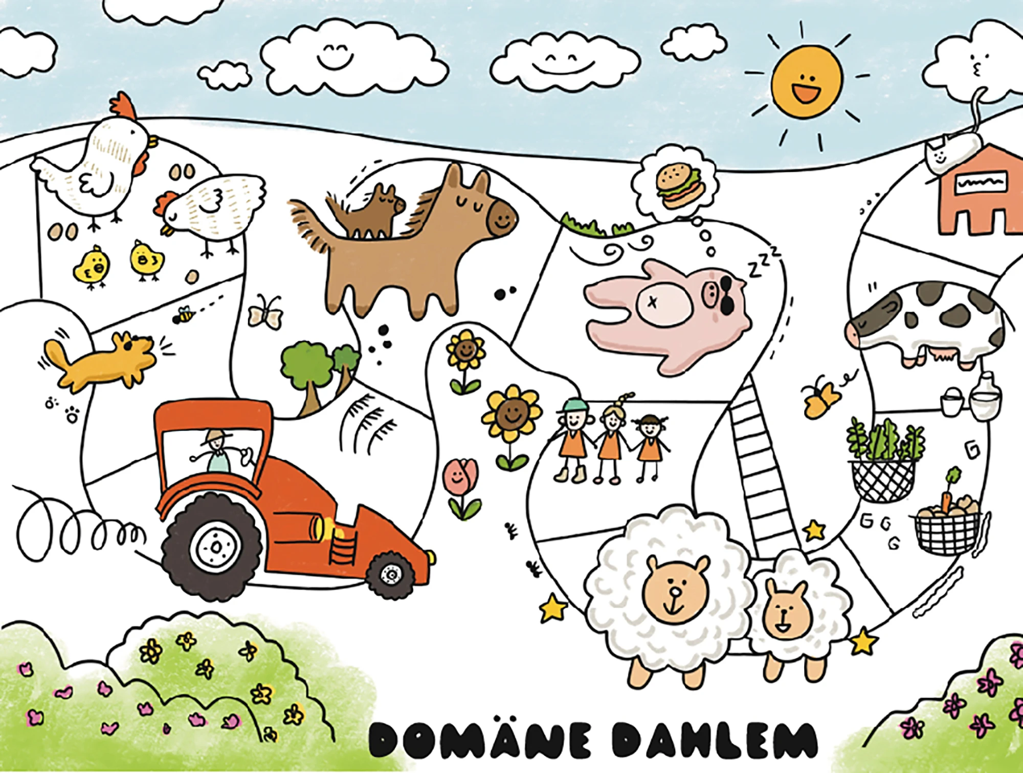
A hand-drawn map for visitors who don't read the signs.
An illustrated visitor map for Domäne Dahlem, a historic farm-museum in Berlin, where text-heavy signage was getting in the way.
What the project was
Domäne Dahlem is a working historic farm in Berlin, but the visitor signage was a wall of German text, and a lot of the visitors were international. The brief was to produce a single illustrated handout that worked across languages, age groups, and reading levels. A map you could give to a child and an academic, and both would find their way.
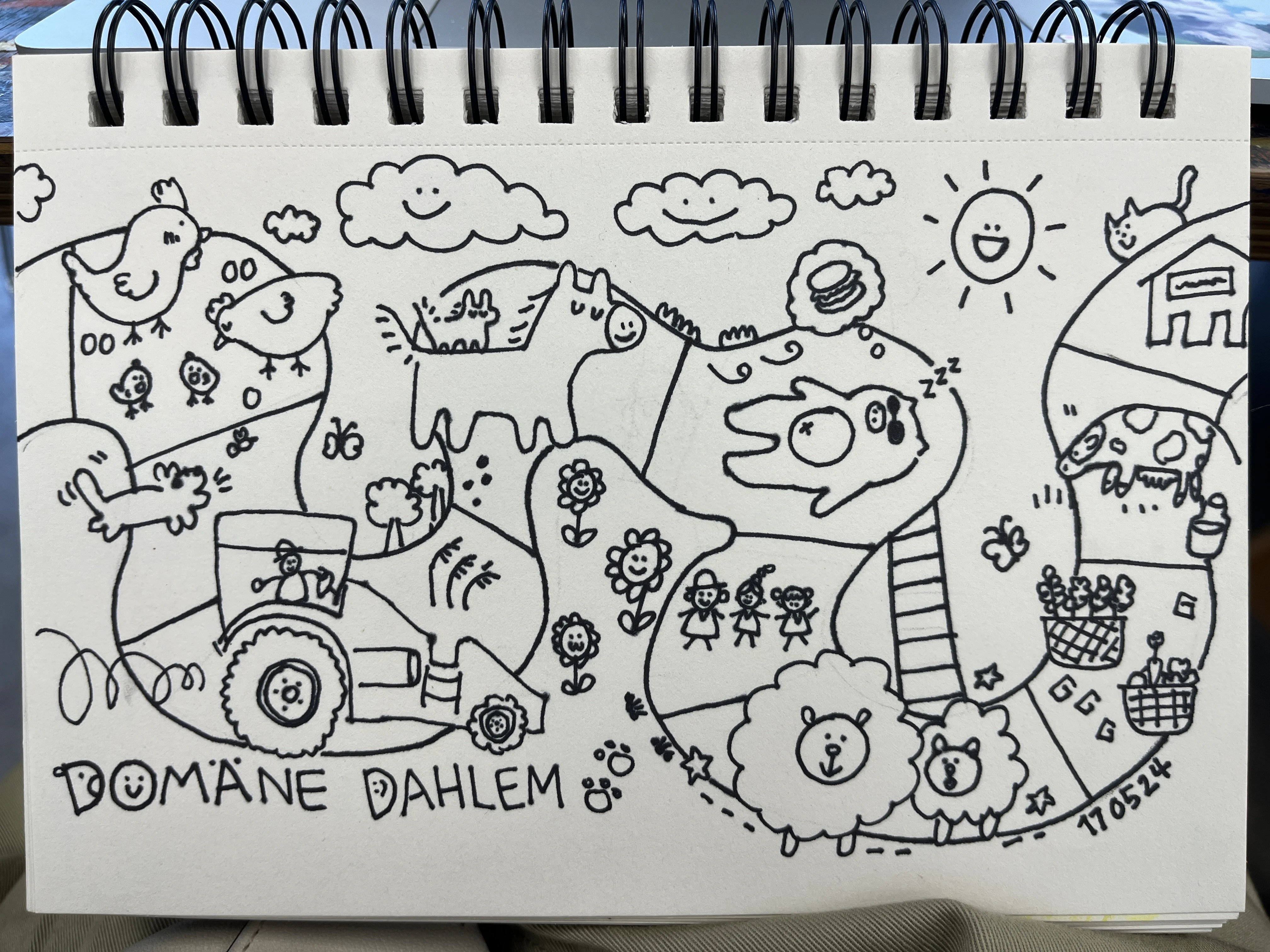
How I worked
Site visit
Walked the site twice. Once with the staff, once as a visitor.
Location mapping
Reduced the site to the landmarks worth drawing and the routes between them.
Style
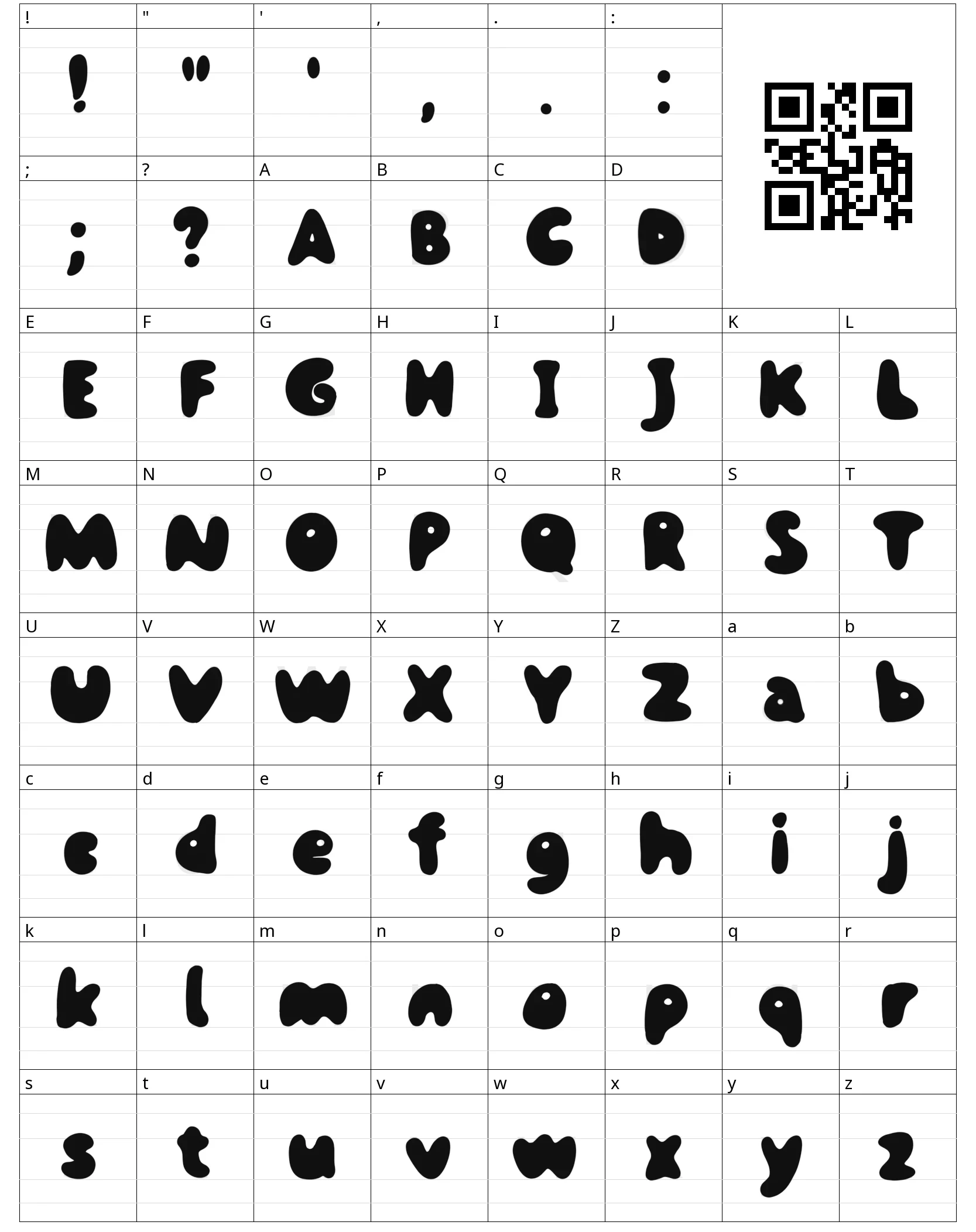
Chose a warm, hand-drawn style. Friendly enough for kids, considered enough for adults.
Icon system
Drew location icons that read as architecture, not just dots.
Icons that say the place out loud.
What I took away
Illustrated wayfinding works when each icon tells the place's story at a glance. The map is doing translation, but it's also doing invitation, making people curious enough to walk further than they planned.