An AI buddy that turns "screen time" into "good time".
A kids app concept I shaped around two users at once. A child who wants a friend, and a parent who wants peace of mind.
What the project was
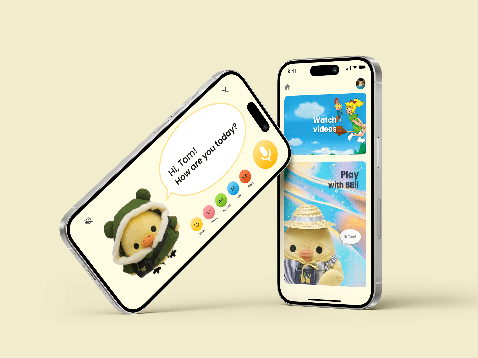
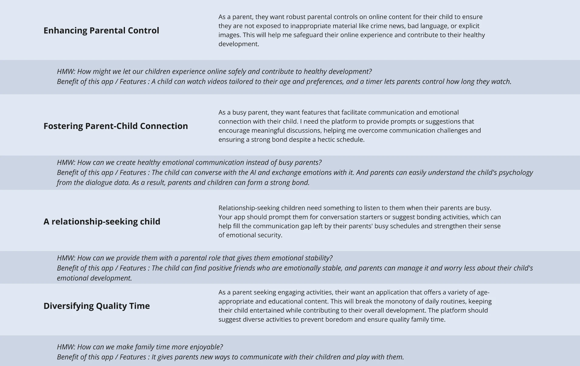
Working parents wanted to feel less guilty about what their kids did with a device, but the alternatives were either too restrictive or too hands-off. Budiya looked for a third path. An AI buddy that the child actually wanted to hang out with, paired with quiet visibility for the parent that didn't feel like surveillance.
How I worked
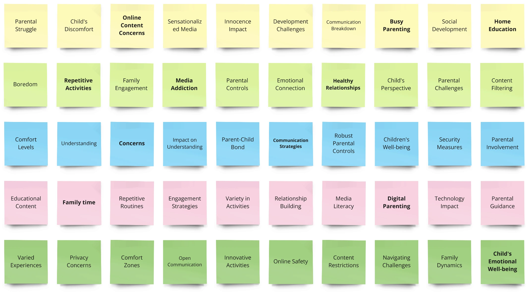
Parent research
Talked to parents about screen-time guilt, the tug between control and trust, and what a good day looks like.
Safety review
Mapped data minimisation, consent layering, and content guardrails into the spec before any screen got designed.
Conversational UX
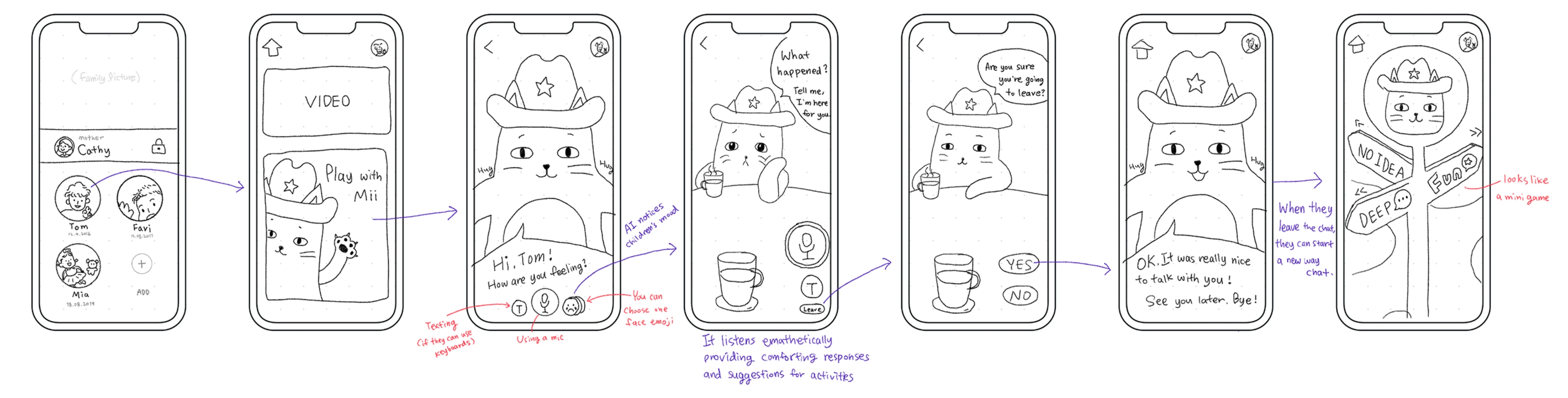
Designed Buddy's voice and patterns. Playful and warm, never preachy, never selling anything.
Prototype
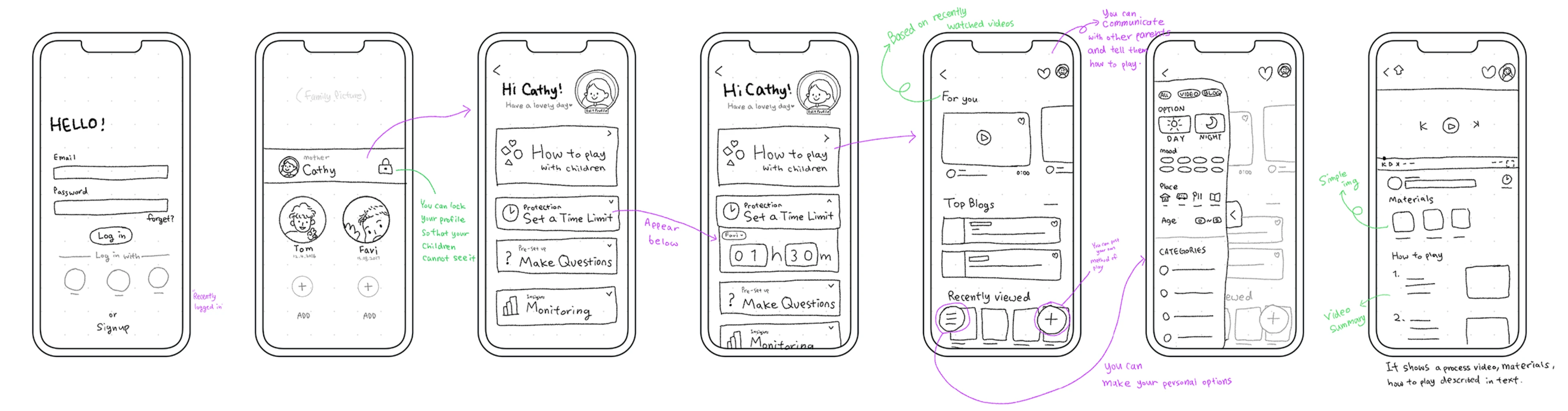
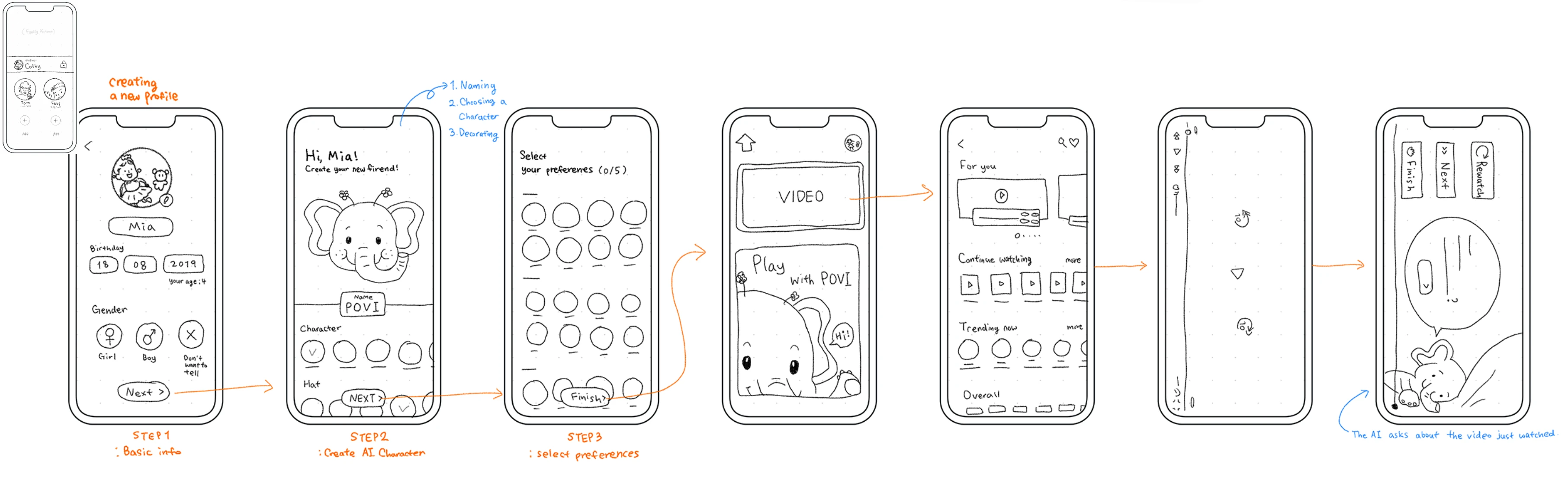
Onboarding, the AI chat, the daily plan, and a parent dashboard. Clickable and walkthrough-ready.
A friend for the kid.
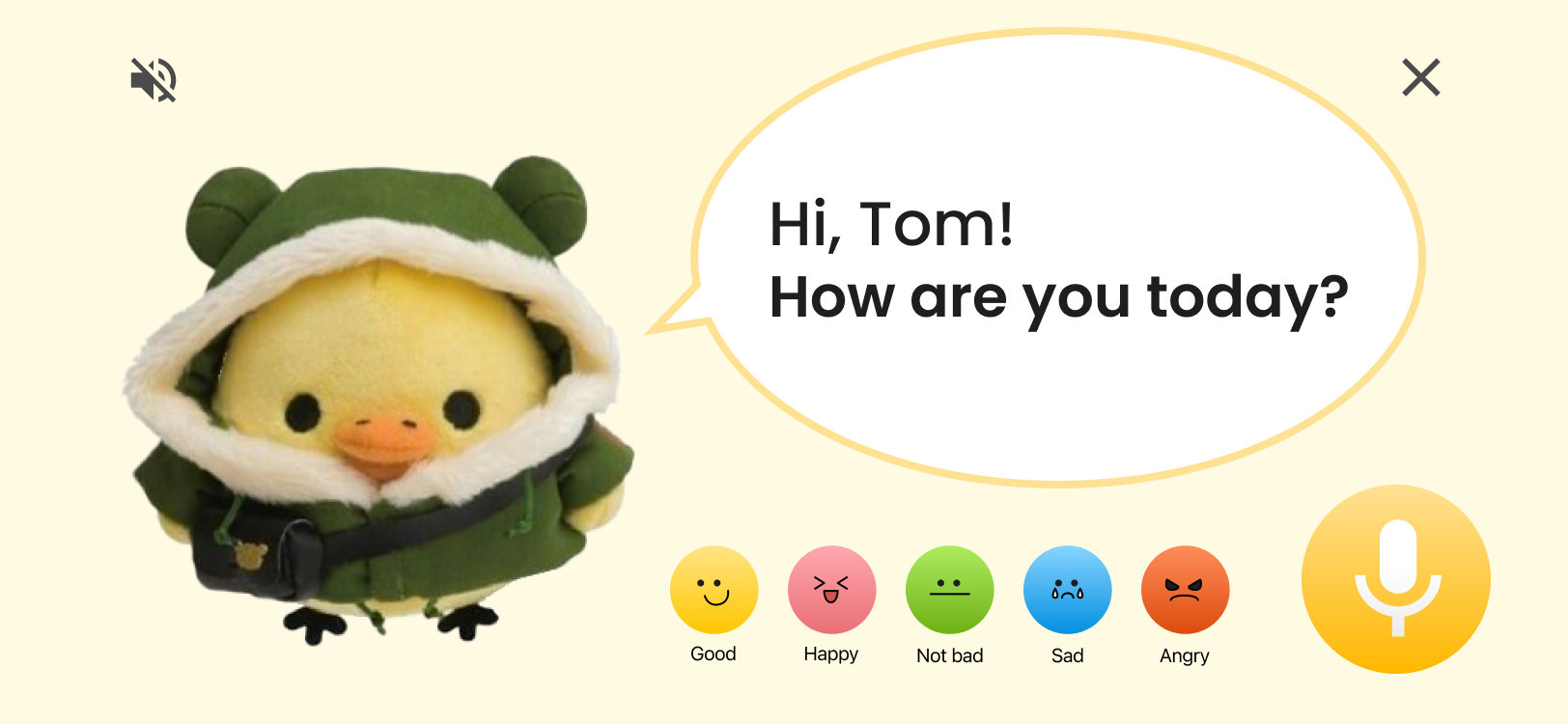
I designed Buddy to lead with emotion, not content. The first thing it asks is how you feel, so the app feels like a friend checking in, not a feed waiting to autoplay.
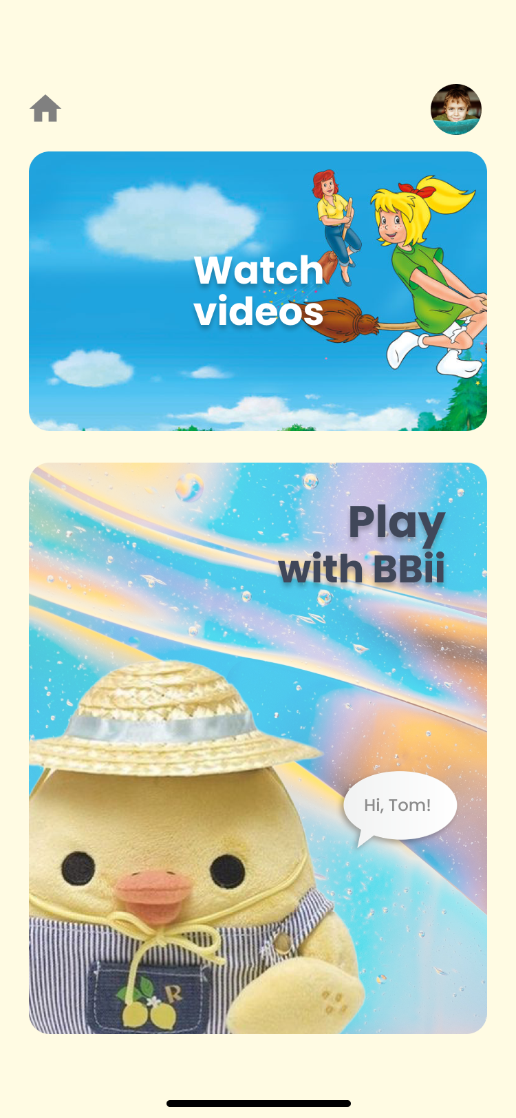
A window for the parent.
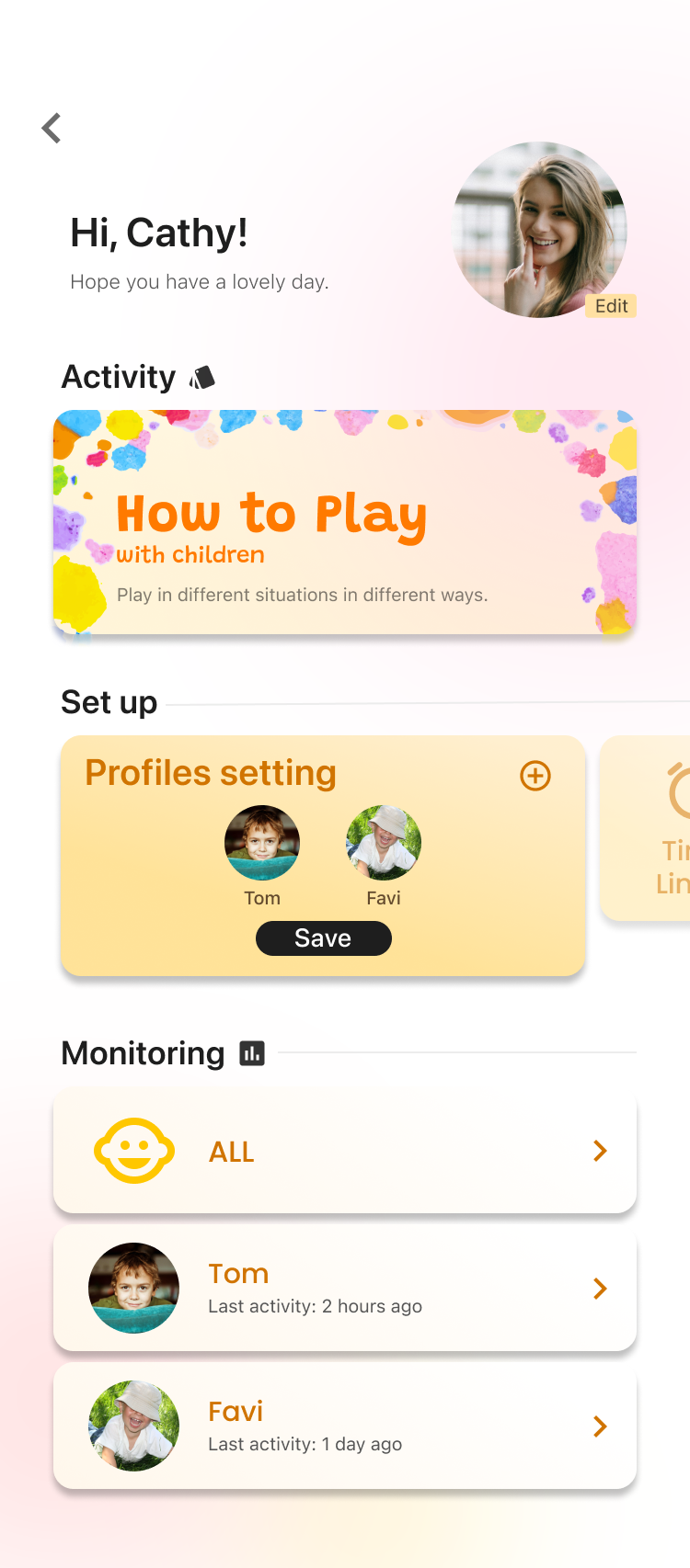
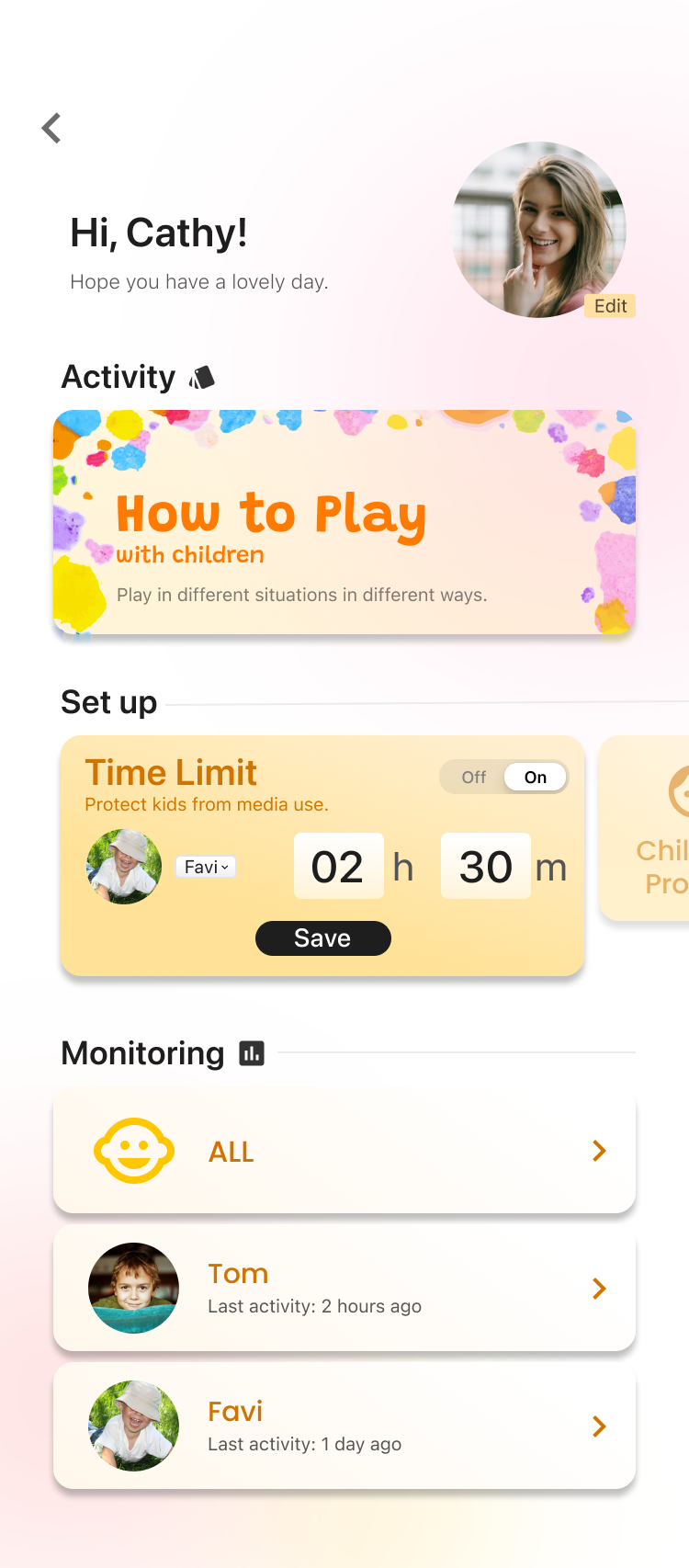
The hardest part was making parental visibility feel like trust, not surveillance. I kept it to gentle limits and a calm activity view, never live tracking of the child.
What I took away
Designing for kids isn't about adding cute. It's about building two products at the same time, one for the child and one for the parent, that quietly trust each other.